Ready to grow?
Website Helped Robert Geans Win $308K Job
2x Expected Opening Weekend Attendance
Cheetos Collab drove 184K+ Impressions
Donations Up 250% After Video
Our Design Helped Secure $50M Grant
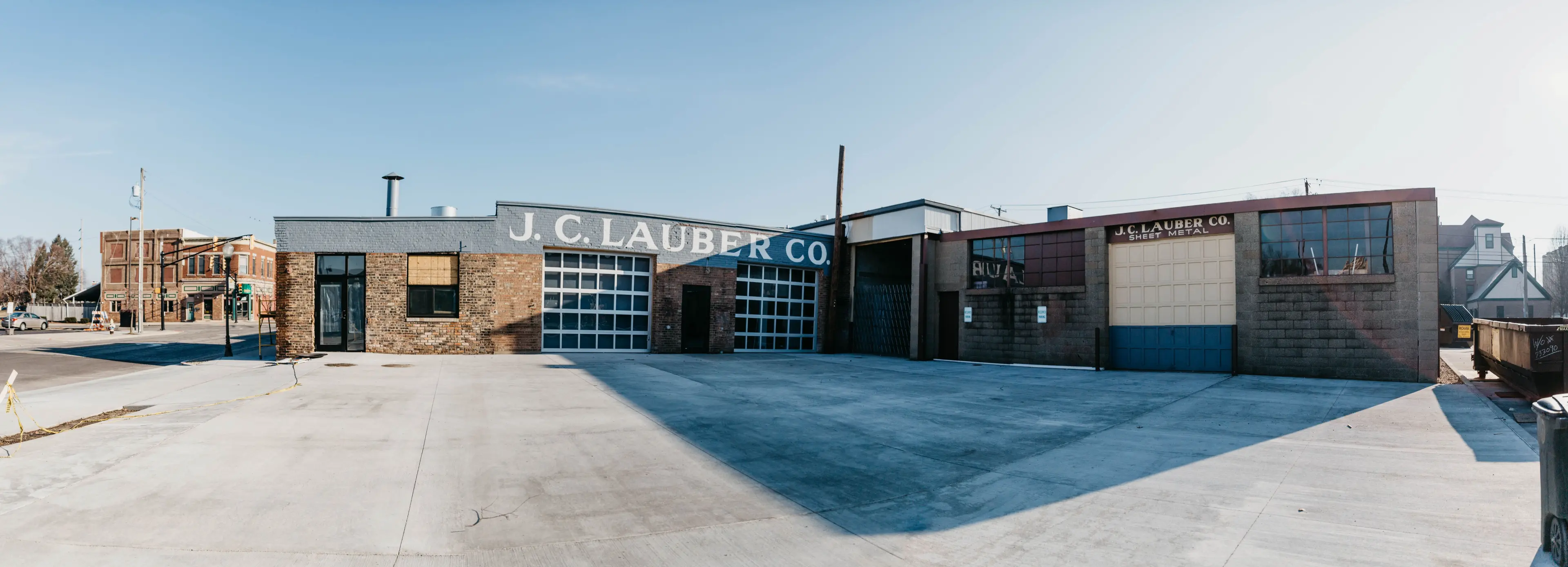
A brand for an artisan restaurant in the East Bank of South Bend.
The Lauber sought to establish a distinctive brand identity that reflected its rich history and unique coal-fired oven cooking method. The challenge was to create a visual identity that honored the Lauber family’s legacy and stood out in the competitive restaurant scene.
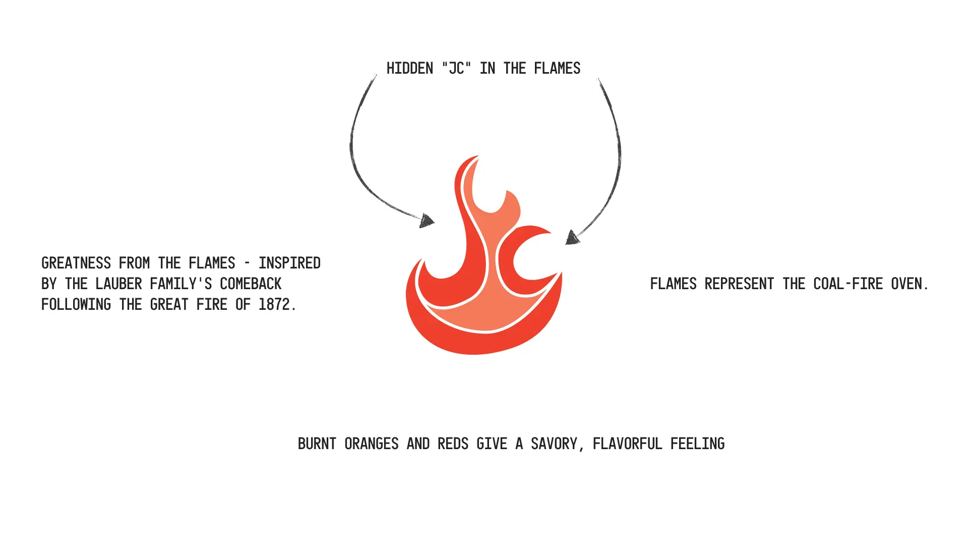
The brand refresh included a dynamic new logo inspired by the Lauber family’s resilience following the great fire of 1872. The flames in the logo not only symbolize the family’s comeback but also the fire from the restaurant’s coal-fired oven. Hidden within the flames are the letters J and C, adding a personal touch. The visual identity was designed to be both bold and warm, capturing the essence of the restaurant’s culinary expertise and historical roots.
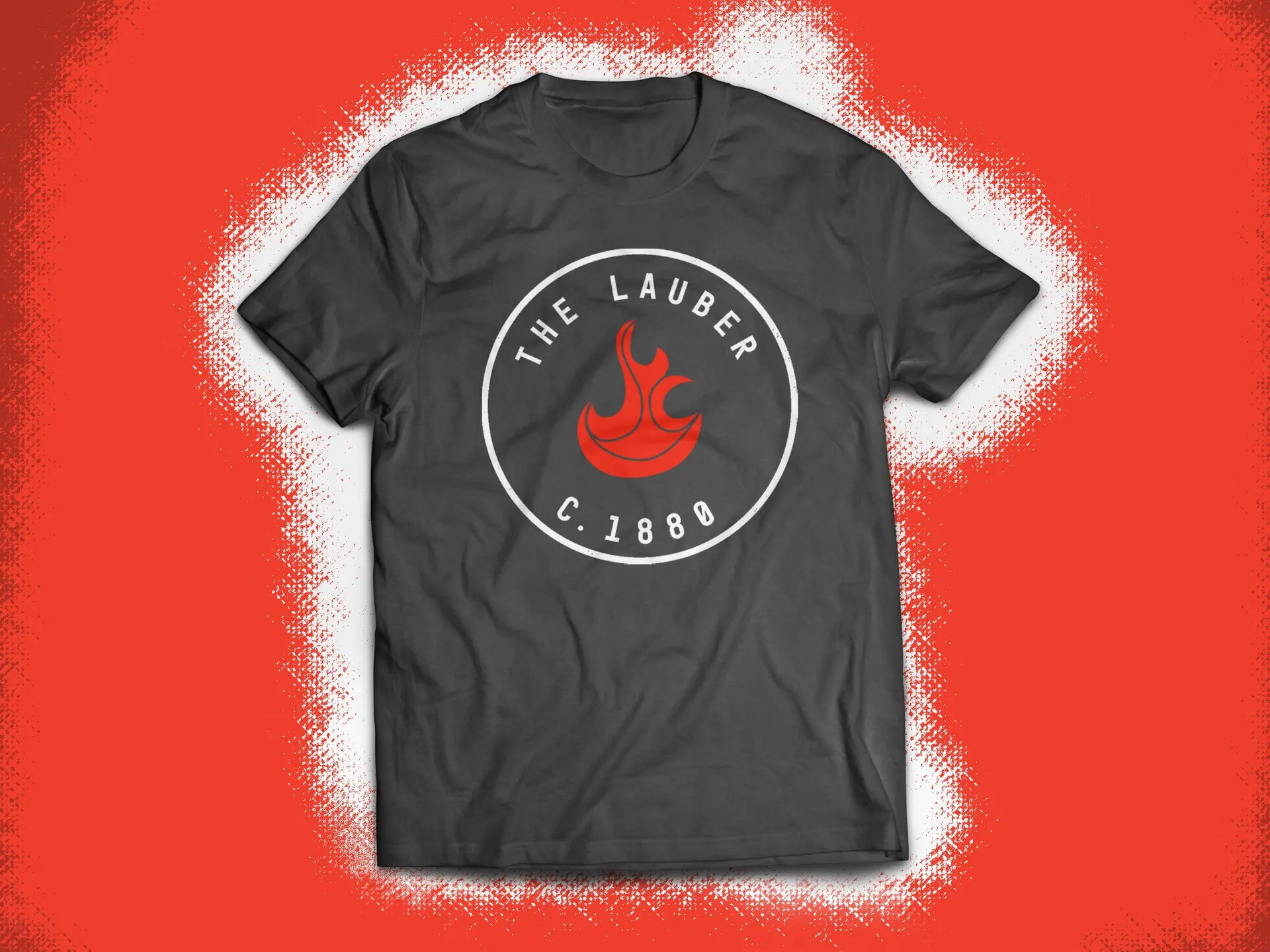
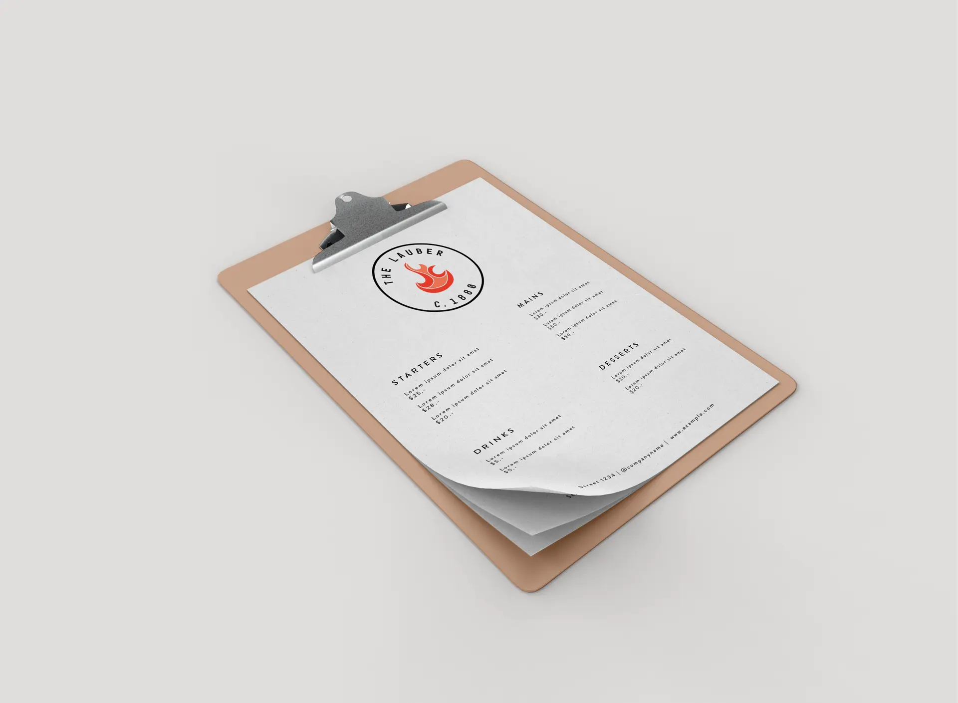
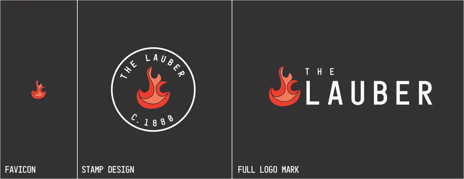
Creation of a cohesive brand identity including logo design, font selection, and color palette, establishing a distinct and memorable visual presence for The Lauber.
The flames are inspired by the Lauber family’s comeback following the great fire of 1872. Hidden in the flames are the letters J and C.
