Ready to grow?
Website Helped Robert Geans Win $308K Job
2x Expected Opening Weekend Attendance
Cheetos Collab drove 184K+ Impressions
Donations Up 250% After Video
Our Design Helped Secure $50M Grant
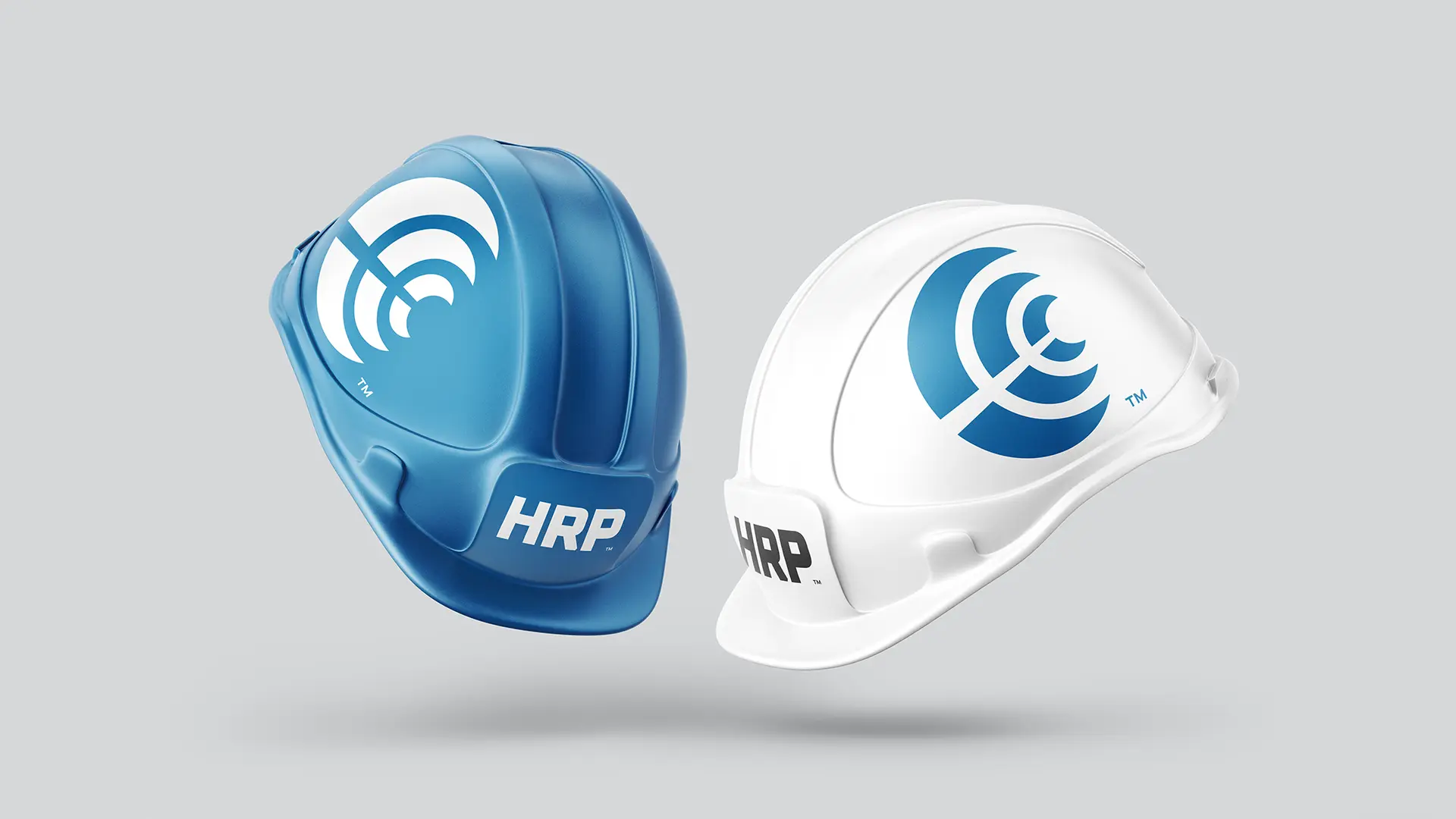
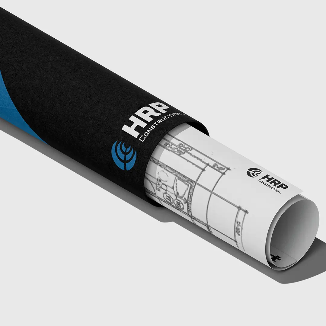
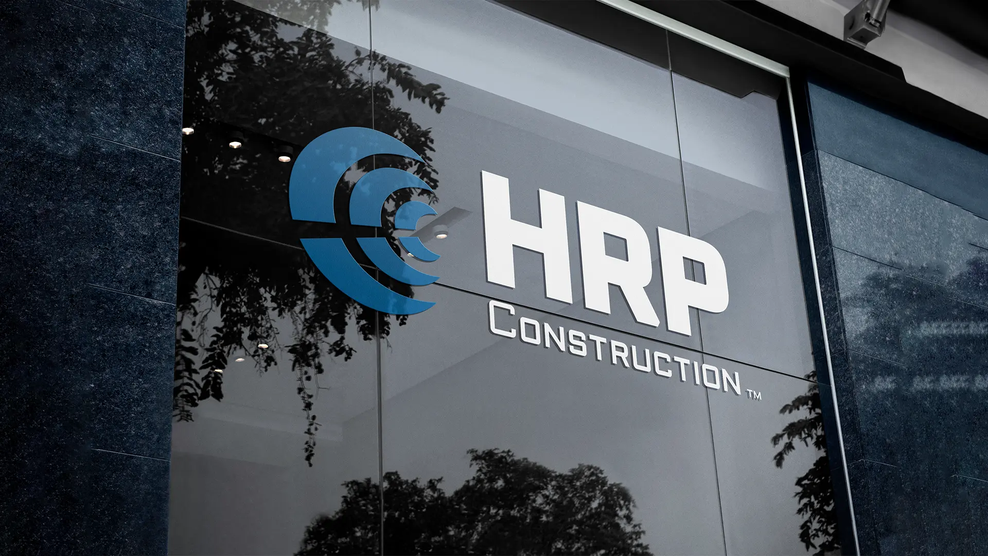
The redesign of HRP's logo presented a unique opportunity for the company to distinguish itself from competitors in its local market. By creating a modern and timeless design, HRP aimed to establish a separate and identifiable brand image that would resonate with its audience.
The strategic redesign of HRP's logo signified a transformative milestone for the company, facilitating the establishment of a unique and identifiable presence within its competitive landscape. This endeavor was driven by a vision to craft a contemporary design with enduring appeal, embodying scalability while upholding the inherent trustworthiness synonymous with the HRP brand. Through this strategic redesign, HRP strategically positioned itself as an industry leader, establishing a benchmark for excellence and innovation that sets it apart from competitors. Complementing the classic blue and white color scheme, a dynamic secondary palette was introduced, infusing vibrancy and vitality into both the industry and the brand.

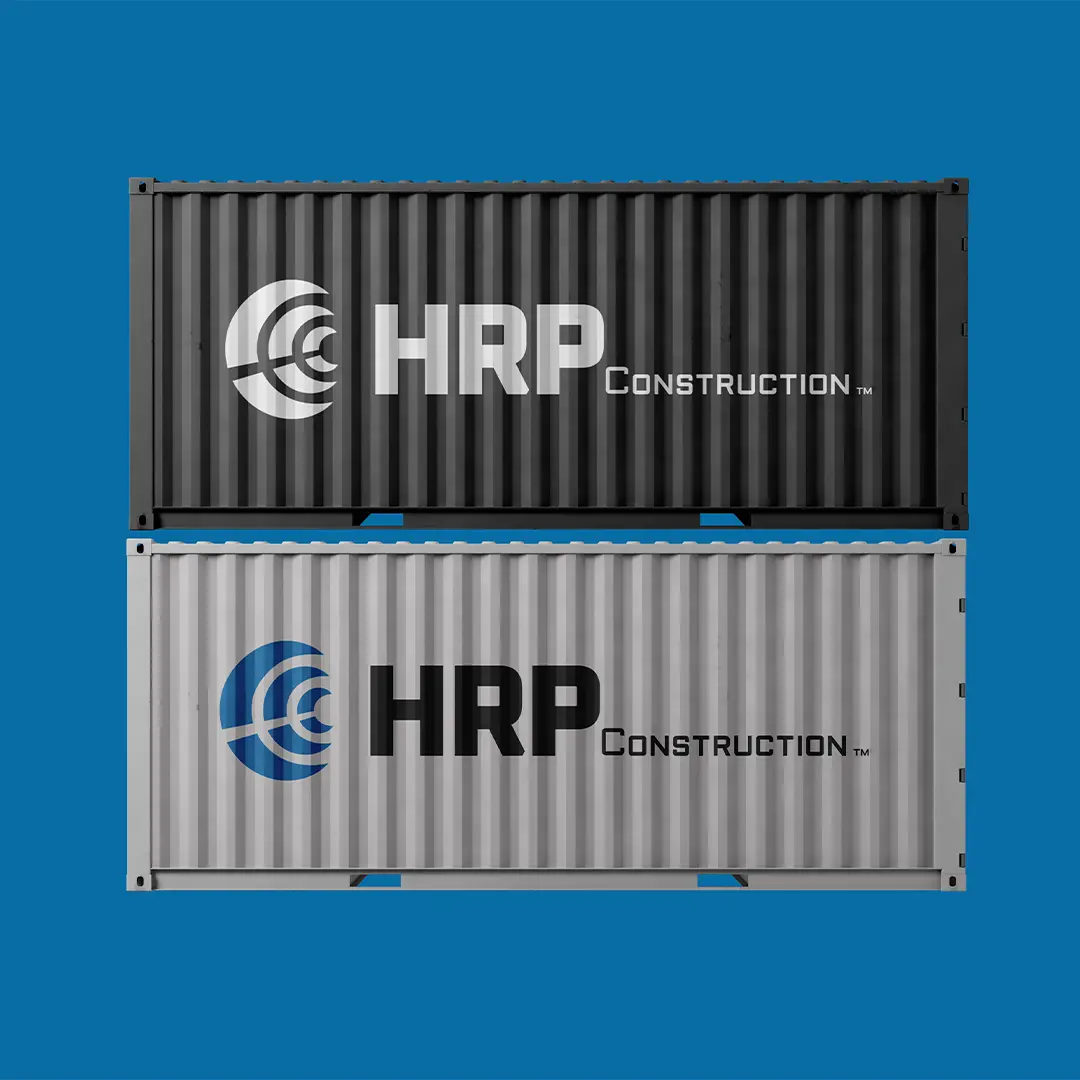
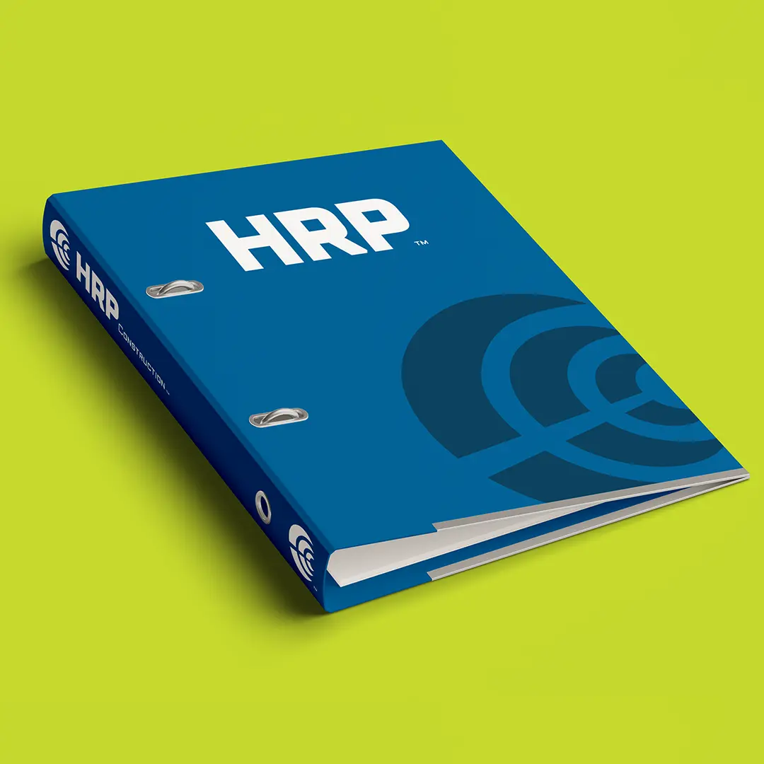
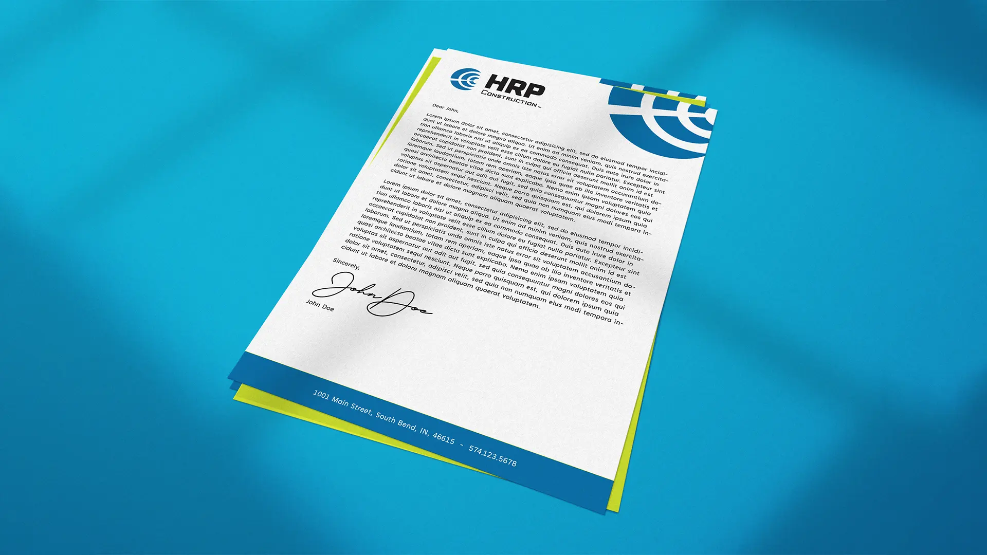

A versatile logo system that alludes to a material used daily on-site, designed to be adaptable across various media, including heavy equipment.