Ready to grow?
Website Helped Robert Geans Win $308K Job
2x Expected Opening Weekend Attendance
Cheetos Collab drove 184K+ Impressions
Donations Up 250% After Video
Our Design Helped Secure $50M Grant
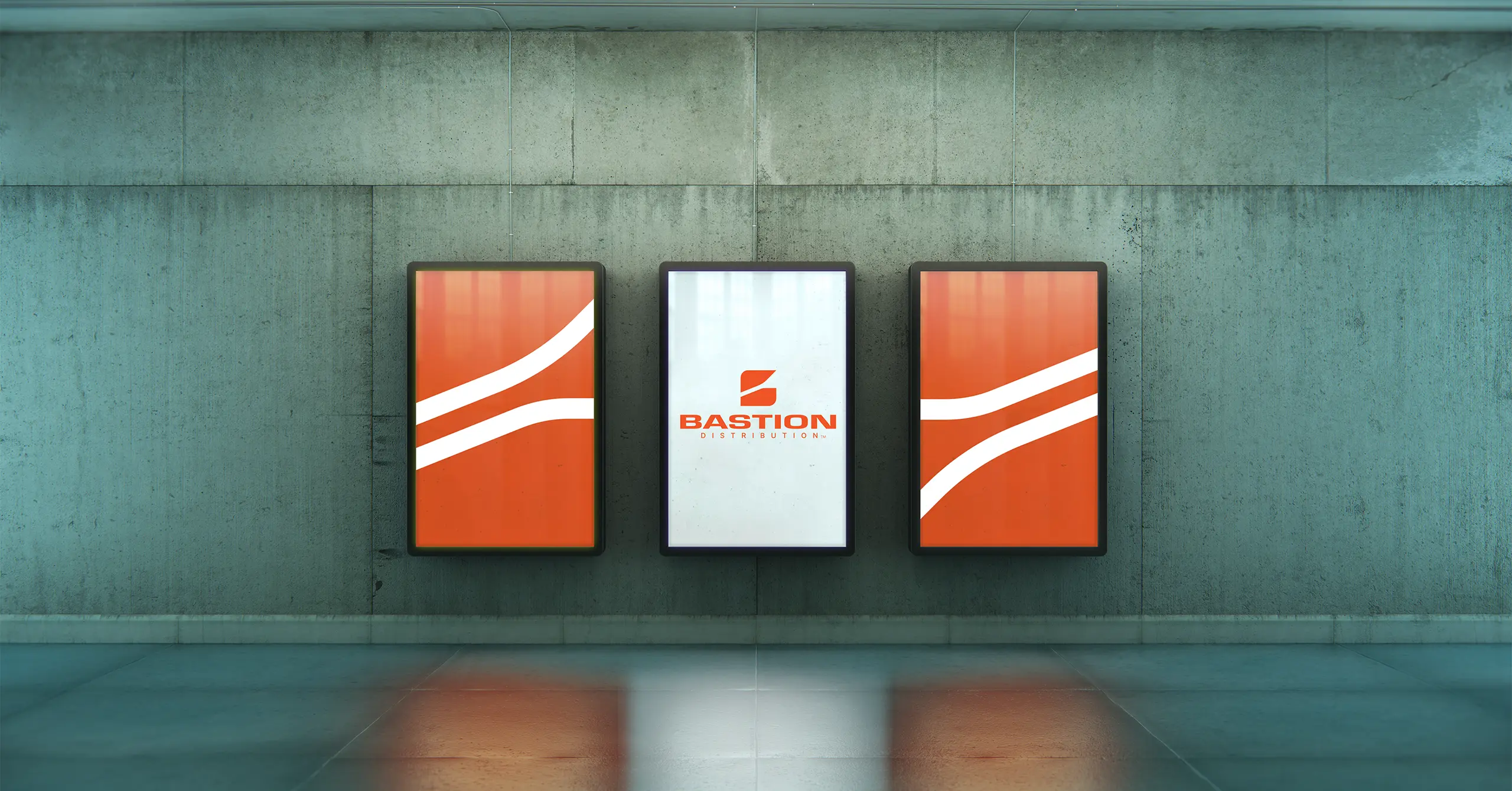
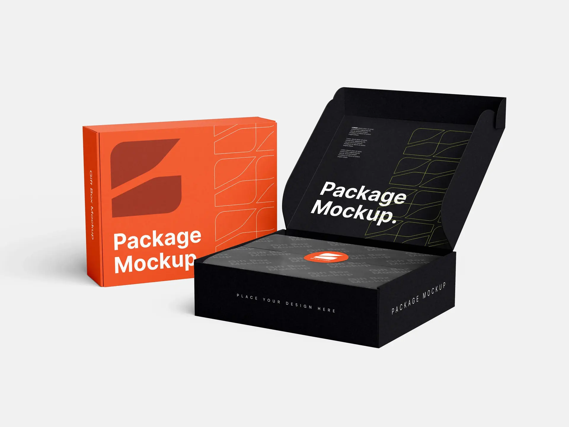
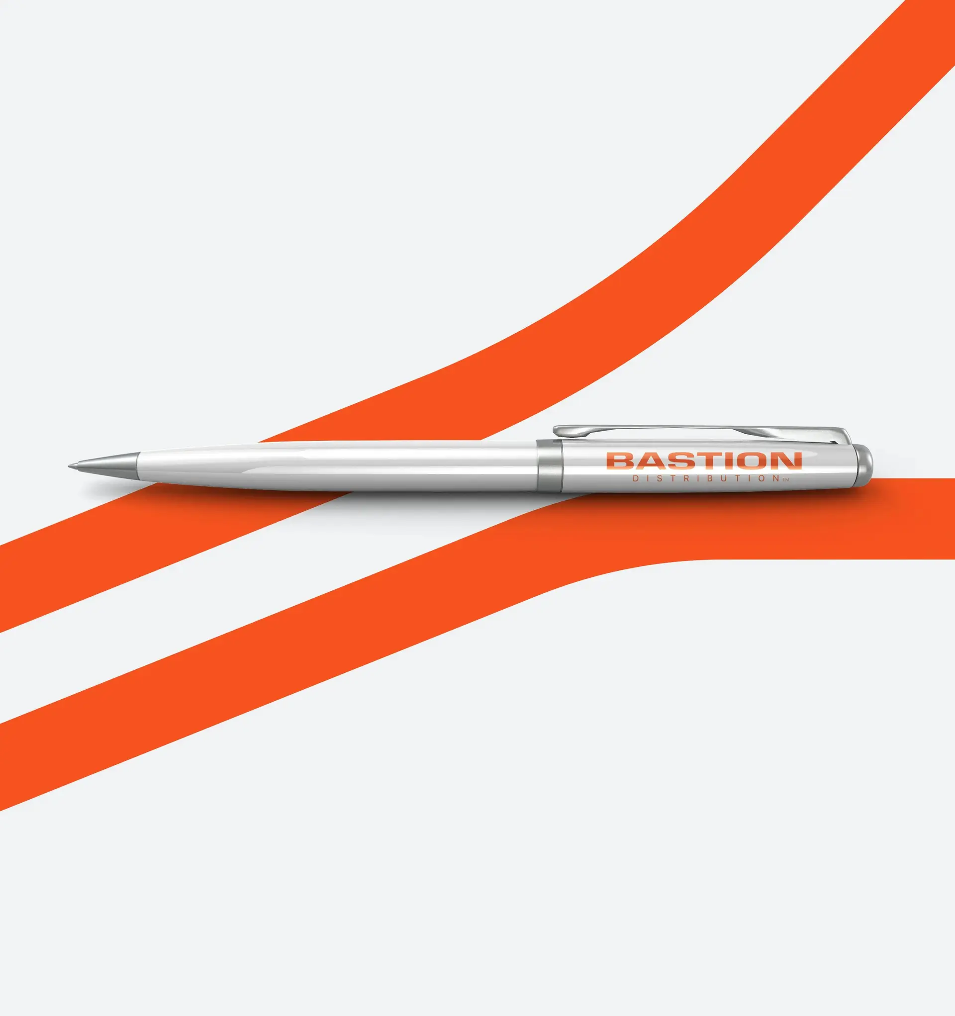
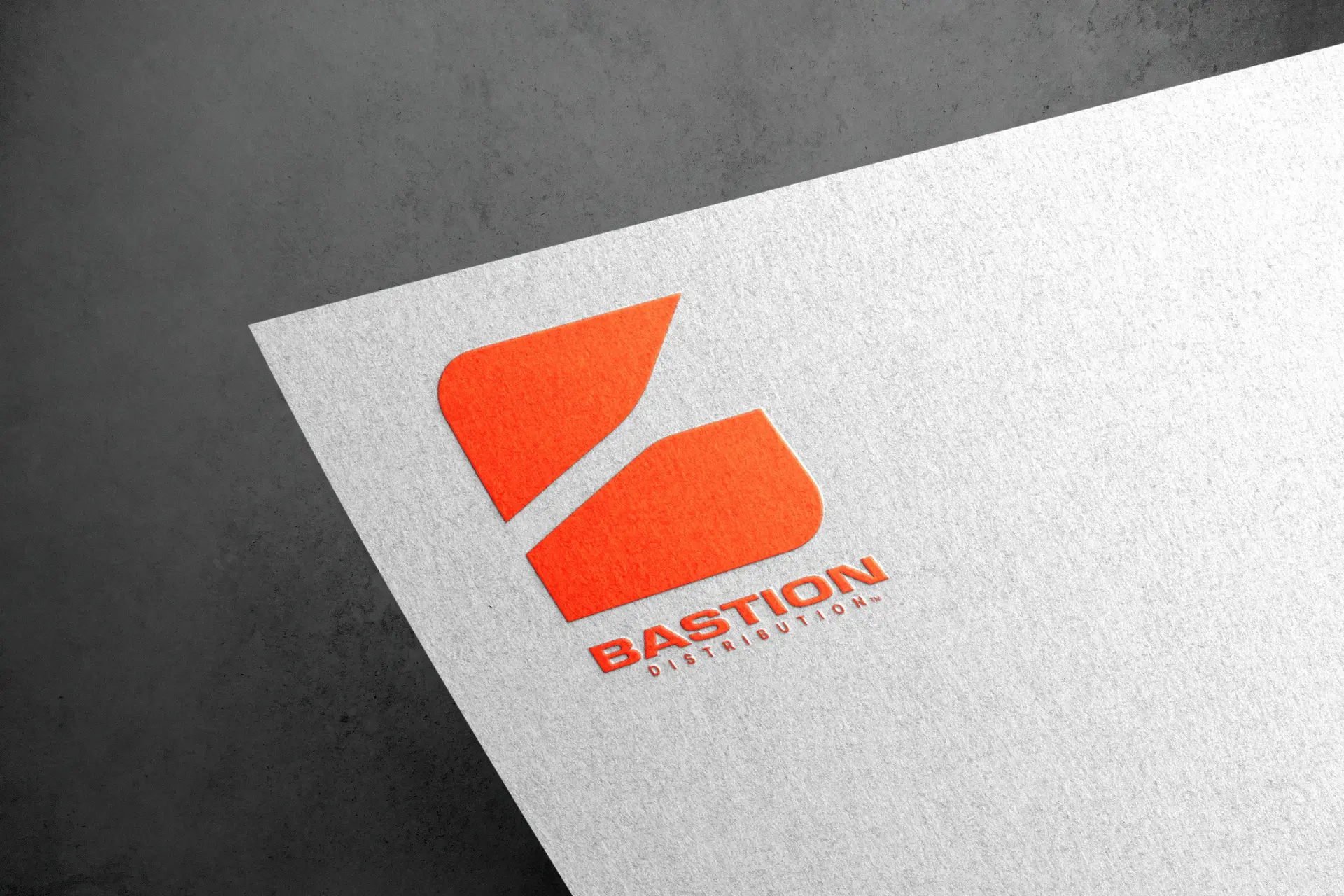
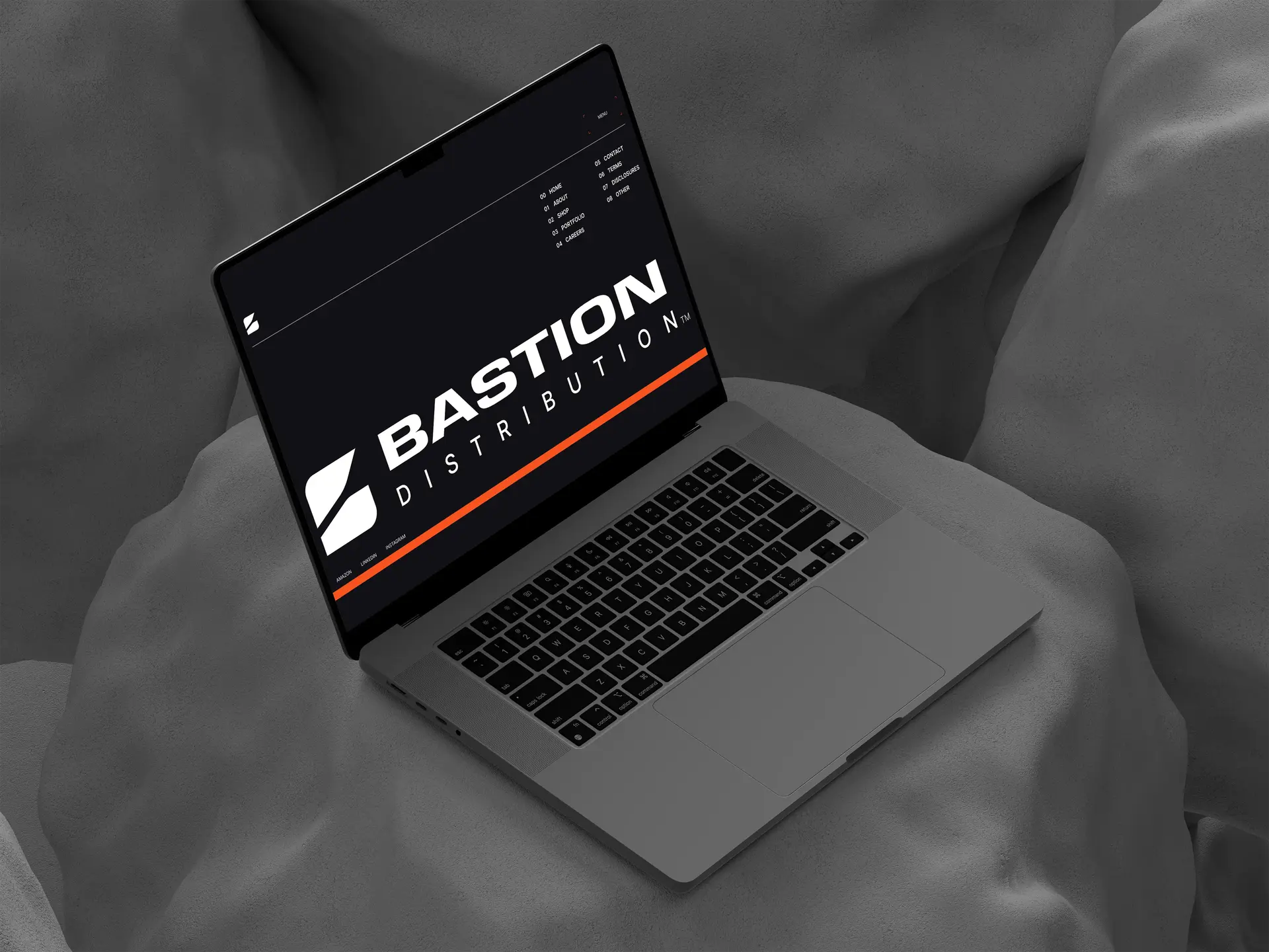
Bastion Distribution is committed to elevating the outdoor experience through the innovation of RV jacks and accessories. Bastion came to us needing an elevated brand that reflected this.
Bastion’s new brand resembles the structure of a bastion fort, cleverly shaped as the letter 'B,' designed within a square, and a bold typeface for a sense of stability and symmetry. The brand includes modernized shapes, patterns, and colors that bring out the sense of innovation within its stable structure.

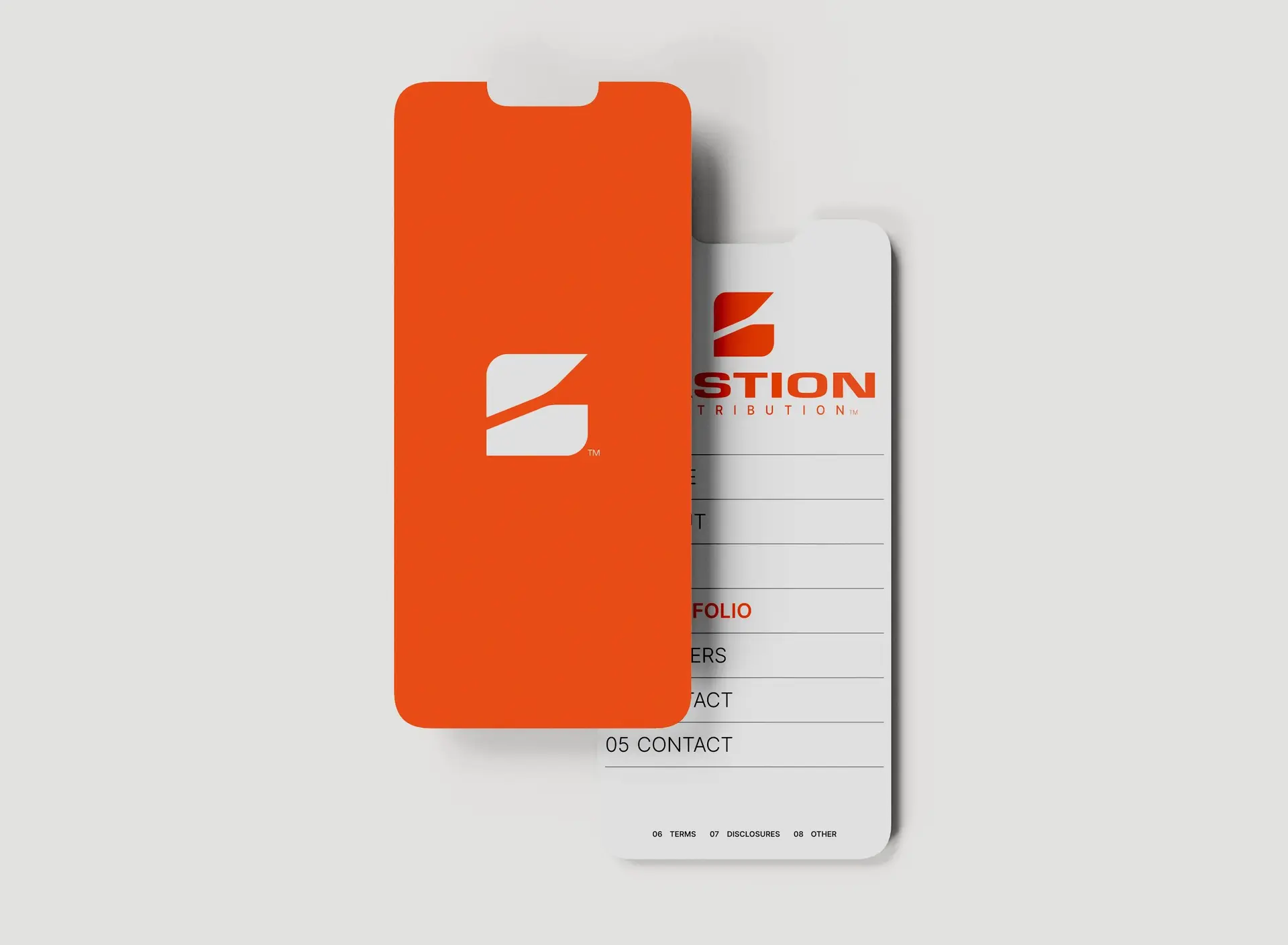
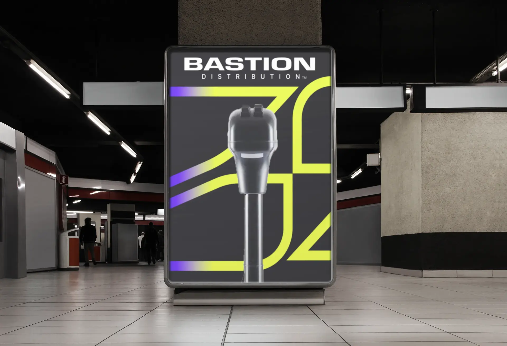
As a team, our aim was to create a brand that authentically resonated with Bastion Distribution's mission and values. We began by identifying the unique essence that distinguishes Bastion and sets it apart in the market. With this groundwork laid, our team innovated a solution that meticulously reflects Bastion's identity in every visual aspect, including shapes, colors, patterns, and fonts. The resulting brand encapsulates the very essence of Bastion Distribution.
A logo reveal animation was created to present the new brand to the client.